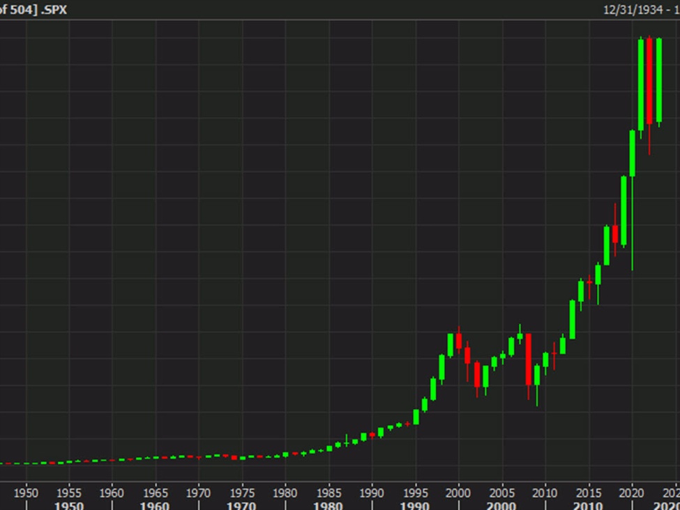
SPX yearly
Oh to have a time machine.
A look at long-term US equities is a humbling exercise. The index started 1994 at 466, and while it suffered a loss that year, it has since risen 10-fold, paying dividends along the way. That’s an incredible 30-year return.
Skip ahead to the final trading day of 2008 — a time I remember well — and the index was at 903 and the world was in a panic. Stocks would bottom that March and have risen 5.2x since in what was a one-way trade until covid hit.
The message from this chart is to buy and hold but it’s also worth remembering that the second half of this chart was an unprecedented period of demographic improvement, falling inflation, falling corporate tax rates and globalization. None of those things will be repeated in the coming decades.
But that doesn’t mean today is the end of an ear. The market is increasingly sniffing out a return to low inflation, which is a powerful tonic when combined with the infatuation the market is developing with leverage. I can easily see a future where higher multiples are the standard and that’s something that could keep the party going for a few more impressive green candles.